September 2025
Product
UT Registration Plus
Role
Product Designer
Team
3 Product Designers
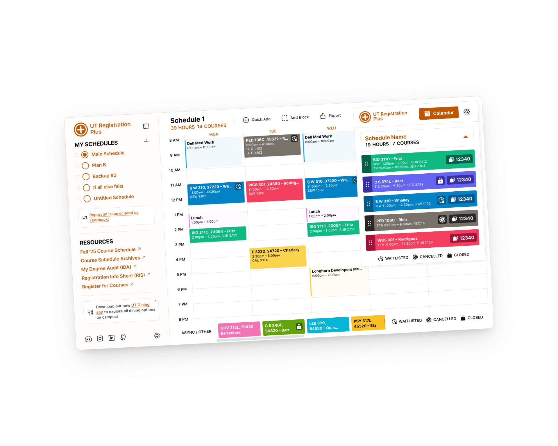
The Product
The Task
The Solution
User Testing Summary
Testing and feedback surfaced problems across the extension: missing time blocks, no schedule generation, limited course information, and no way to add courses by code. Two visibility issues stood out most starkly from testing: 2 out of 5 users missed the calendar button entirely, and 4 out of 5 didn't know they could switch schedules from the popup.

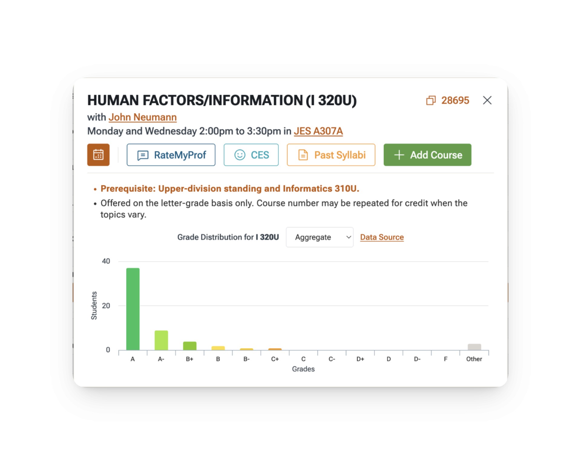
Finding #1: Hidden Calendar Access
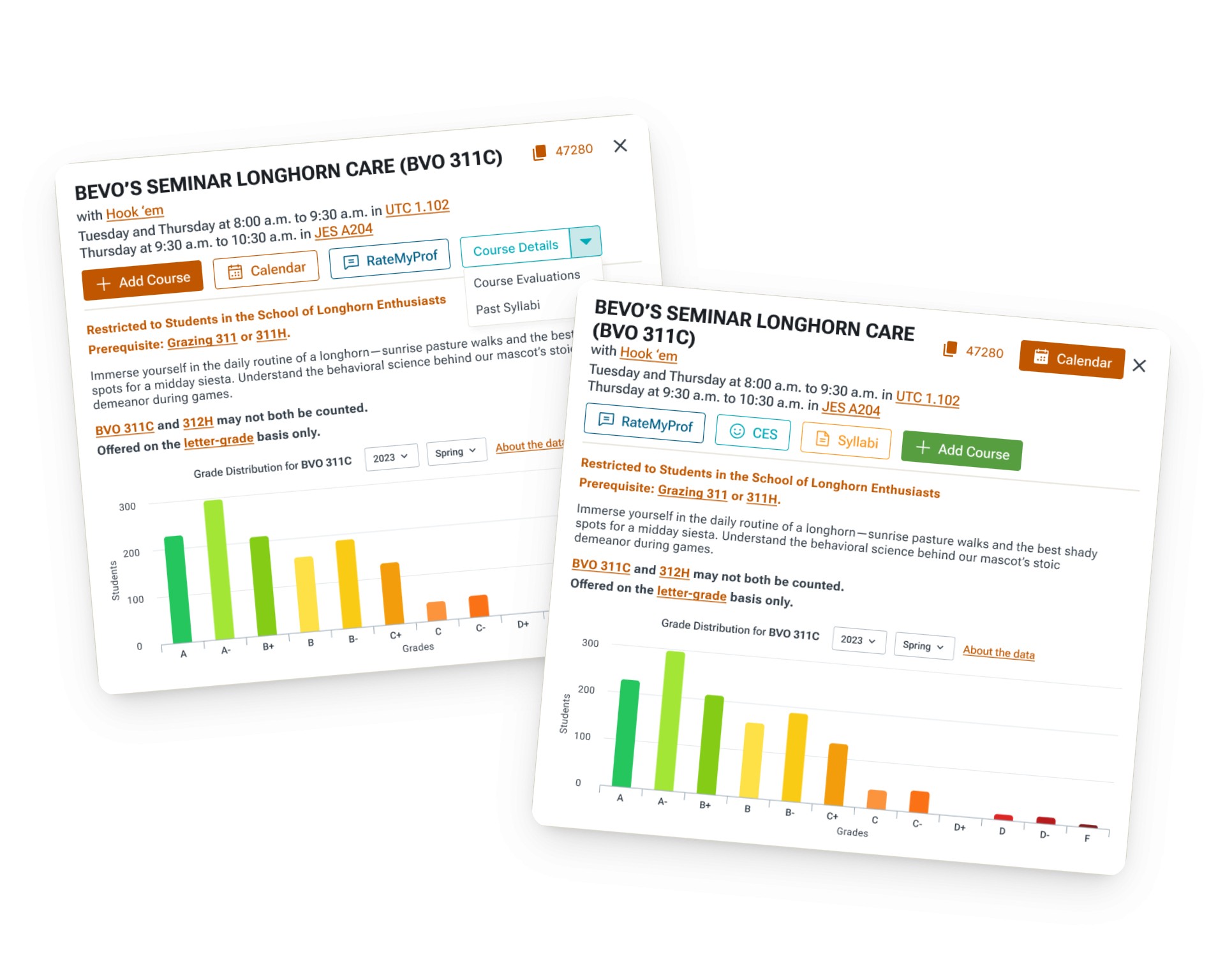
The calendar button on the course card is visually indistinct from the other action buttons. At a glance, it reads as one of several equal options, so 2 out of 5 users in testing missed it entirely and navigated to the extension popup instead to access their calendar, adding unnecessary steps to a repeated task.
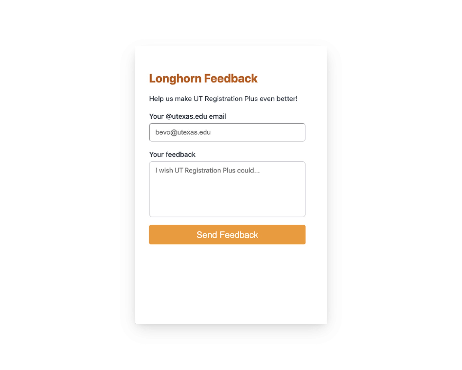
Finding #2: Off-Brand Feedback Entry
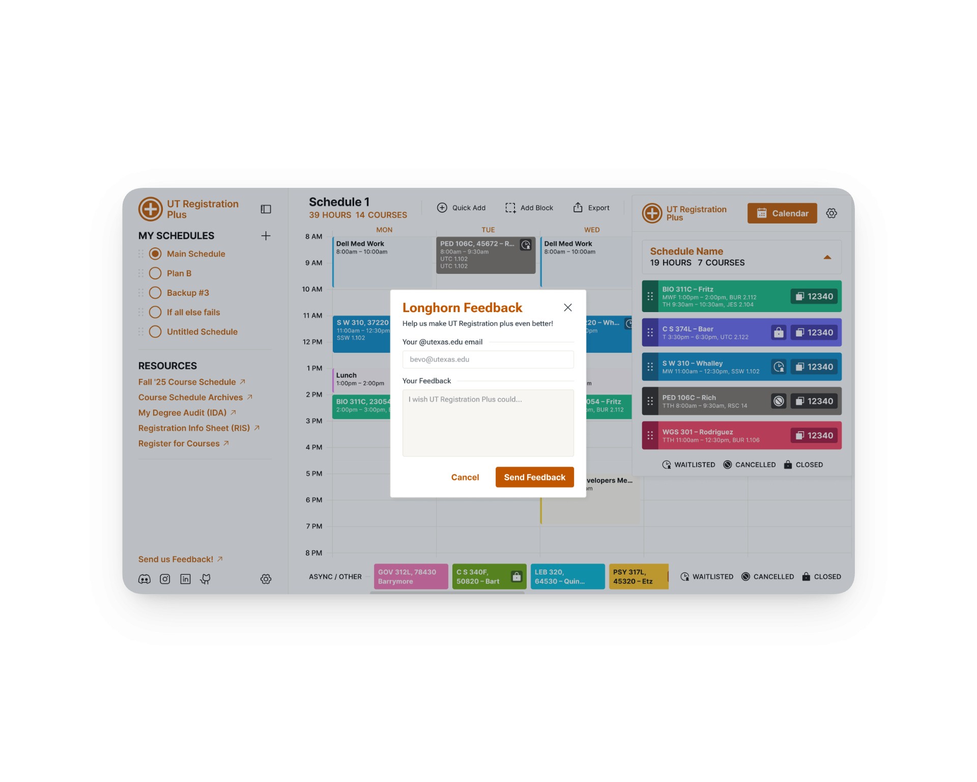
The feedback button and submission form didn't follow Longhorn Developers' existing design system. The entry point for submitting feedback wasn't visible enough to surface organically, and the form itself had no consistent visual relationship to the rest of the extension's interface.
Finding #3: Too Many Steps
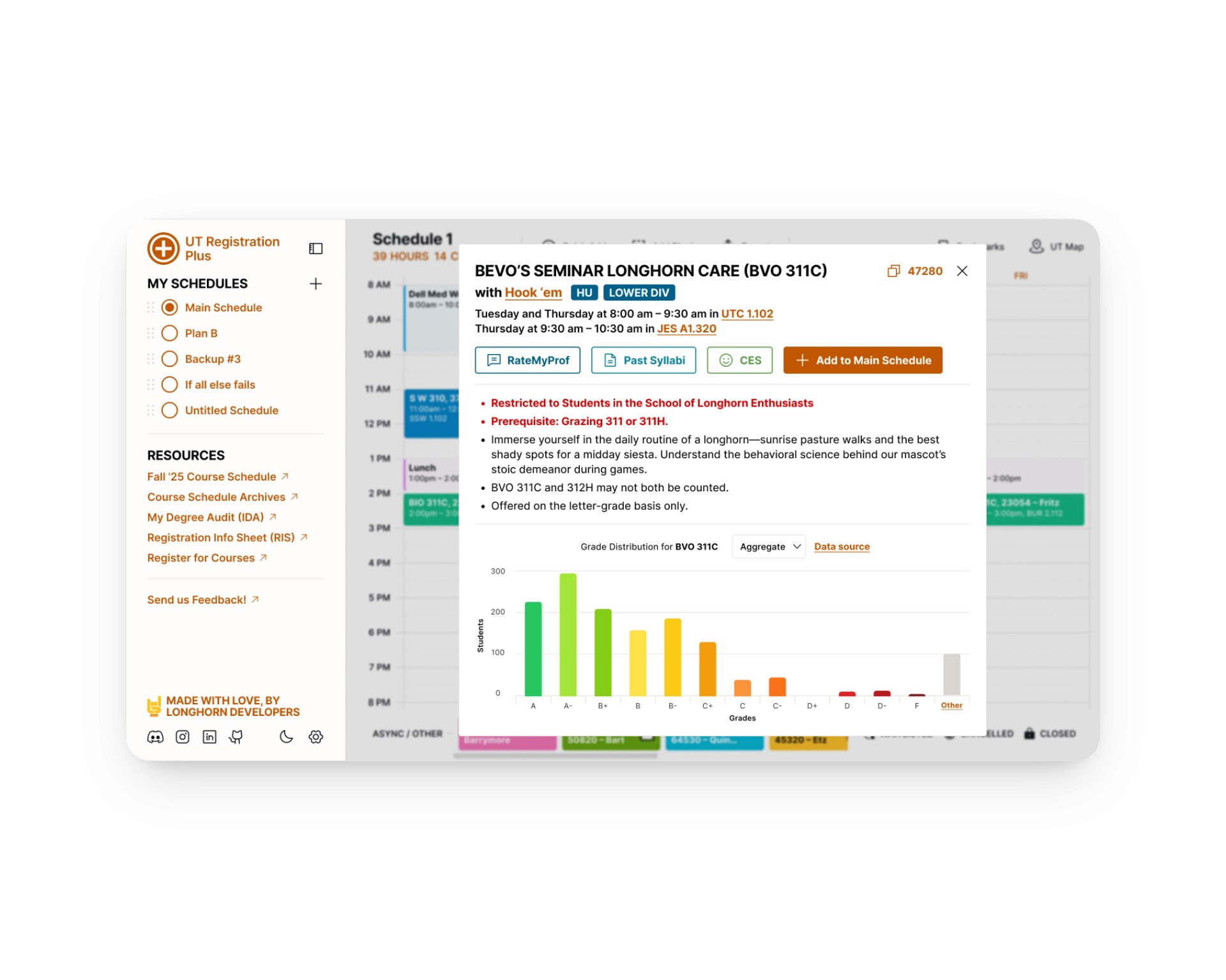
To add a course to their schedule, students had to open the course schedule on the UT site, find the specific class, open its modal, and then add it from there. For students who already knew exactly which course they wanted, usually by unique course number, this was several steps to complete a task that should take one. 4 feedback notes specifically asked for a way to input course codes directly without navigating back to the UT site at all.
Competitive Analysis
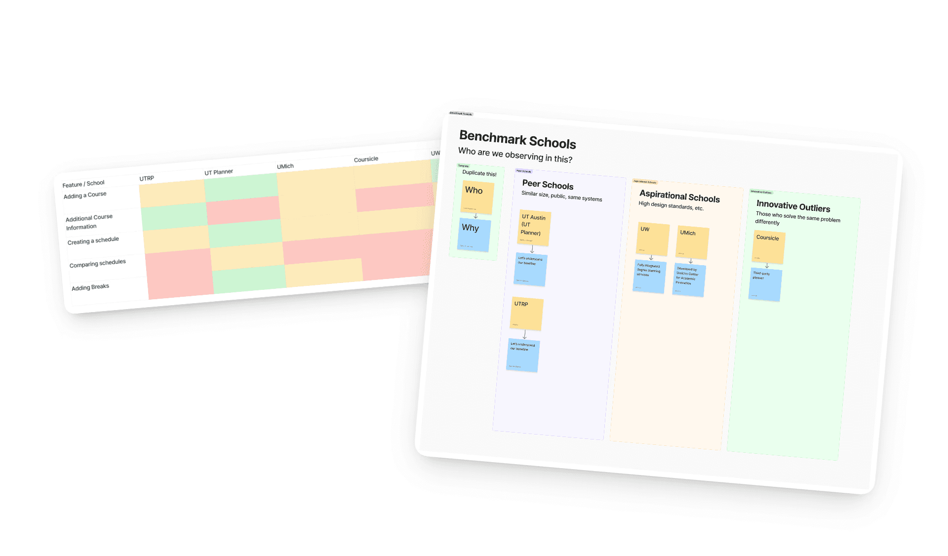
The team benchmarked against four tools across three categories: peer schools with similar systems (UT Planner, UTRP), aspirationally strong tools with high design standards (UW, UMich), and innovative outliers solving the same problem differently (Coursicle). The feature comparison looked at core scheduling functions including adding courses, comparing schedules, and adding breaks, to identify where UT Registration Plus had gaps relative to both its peers and its aspirational targets.

Quick-Add
Quick Add went through the most iterations of the three features. The core question was whether a unique course number alone was enough input, or whether students needed more options like semester selection. We also had to design for failure states: what the interface shows when a course code doesn't exist, when the course is already on the schedule, or when it's closed.

Solution
Quick-Add
Students can now input a unique course number directly from the extension's schedule view without navigating back to the UT course schedule site. The input sits inline with the calendar, semester selection is handled by a dropdown, and the interface returns a specific response for every state: course found, course not found, already added, or section closed. No ambiguity about what happened or what to do next.


Modal Redesign Visibility
The calendar button on the course card was redesigned for visual hierarchy, given distinct weight and placement relative to the other action buttons so it reads as the primary action rather than one of several equal options. The modal layout was also updated to surface the most relevant course information more clearly and reduce the scan load on a card students are reading quickly.
Feedback Visibility
The feedback entry point was repositioned and redesigned to follow Longhorn Developers' existing design system, making it visually consistent with the rest of the extension. The submission form consolidates input that was previously scattered across email and Discord into a single on-brand channel, with a straightforward two-field form that matches the visual language students already associate with the product.
Cross-functional collaboration
Research -> Action
Designing for a product you use
Being a UT student using UT Registration Plus during registration meant I had genuine context that outside designers wouldn't. That proximity was useful, but it also required actively checking my own assumptions against what testing actually showed, because what bothered me personally wasn't always what bothered the broader user base.