02/ Lumel Powertable
02/ Lumel Powertable
Lumel Technologies builds data visualization tools within Microsoft Fabric. As a UX Design Intern, I worked across three parallel workstreams: researching UI patterns for a marketplace conversion, documenting UI issues in a structured format for developer handoff, and redesigning the admin layout to improve readability and design system coherence.
June 2025
product
Lumel EPM
Role
UX Design Intern
Team
UX, PM, Devs
product
Lumel EPM
Role
UX Design Intern
Team
UX, PM, Devs

02/ Lumel Powertable
Lumel Technologies builds data visualization tools within Microsoft Fabric. As a UX Design Intern, I worked across three parallel workstreams.
June 2025
product
Lumel EPM
Role
UX Design Intern
Team
UX, PM, Devs
product
Lumel EPM
Role
UX Design Intern
Team
UX, PM, Devs
Overview
Overview
Overview
The Product
Lumel Technologies builds data visualization tools within Microsoft Fabric, used by enterprise clients for data planning and analytics. I worked there as a UX Design Intern over the summer. Due to NDA constraints, blank example designs and processes are shared with permission from the design team.
UT Registration Plus is a browser extension built and maintained by Longhorn Developers that enhances the UT Austin course registration experience. It's used by a significant portion of the UT student body, adding features to the university's course schedule that the official site doesn't offer.
The Task
Researching & developing UI layout patterns to inform a marketplace conversion
Building structured UI issue documentation for developer handoff
Redesigning the admin layout to handle high-density data more readably and align it with Lumel's design system.
Researching & developing UI layout patterns to inform a marketplace conversion
Building structured UI issue documentation for developer handoff
Redesigning the admin layout to handle high-density data more readably and align it with Lumel's design system.
The Solution
Delivered a UI issue documentation system in Figma with an indexed structure, annotated screenshots, and exact specs pulled via dev mode and CSS inspection. Contributed layout research for the Snowflake conversion. Redesigned the admin interface to handle large user and table counts without truncation or readability breakdown.
Redesigned the modal's visual hierarchy, color, and scale to make the calendar action more visible. Rebuilt the feedback button and submission form to align with Longhorn Developers' design system. Designed a Quick Add feature that lets students input a unique course code directly into their calendar view, cutting out several steps from the registration flow.
The Product
Lumel Technologies builds data visualization tools within Microsoft Fabric, used by enterprise clients for data planning and analytics. I worked there as a UX Design Intern over the summer. Due to NDA constraints, blank example designs and processes are shared with permission from the design team.
The Task
Researching & developing UI layout patterns to inform a marketplace conversion
Building structured UI issue documentation for developer handoff
Redesigning the admin layout to handle high-density data more readably and align it with Lumel's design system.
The Solution
Delivered a UI issue documentation system in Figma with an indexed structure, annotated screenshots, and exact specs pulled via dev mode and CSS inspection. Contributed layout research for the Snowflake conversion. Redesigned the admin interface to handle large user and table counts without truncation or readability breakdown.
Context
Context
Context
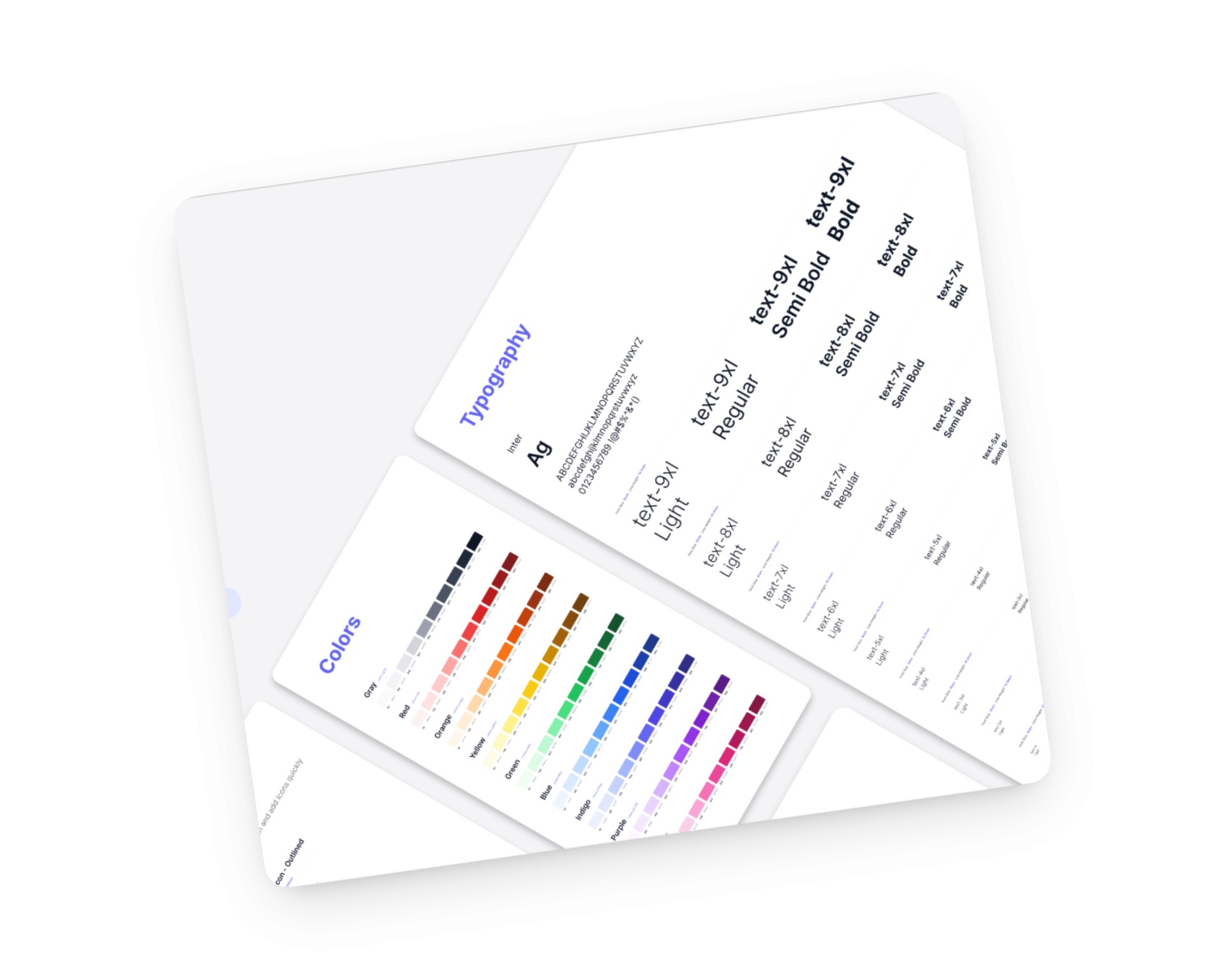
Marketplace Conversion
The company was expanding into a new tools marketplace, which operates under different layout constraints and navigation patterns than the existing product environment. The work involved researching how comparable enterprise data visualization tools handle hierarchy, navigation, and dense data display within a marketplace context to inform how PowerTable should be structured there.
UI Issue Documentation
As the product scaled, UI inconsistencies across components needed a reliable way to get from identification to resolution. Without a standardized documentation format, communicating exact specs to developers required repeated clarification, which slowed the handoff process and introduced room for implementation errors.


Admin Layout
The admin interface handled a large number of users, accounts, and data tables simultaneously. At that density, text in rows and labels compressed in ways that made the interface difficult to scan and manage. The redesign addressed readability and visual hierarchy across the layout while bringing component styling in line with Lumel's design system.
Consistent Systems + Delight
A unified visual and copy system across every screen, with typography, color, and tone that feel warm, intentional, and made for pet owners rather than pulled from a generic IoT template.
Feeding: Front & Center
The next meal is the first thing owners see when they open the app, with each pet's schedule visible at a glance so no one has to dig through tabs to answer the question that brought them here.
Clear Task Flows
Setup, scheduling, and editing each move forward in a single path with visible states and clear feedback, so owners always know where they are, what just happened, and what comes next.
Define
Readable at Scale
Enterprise admin interfaces carry real data volume. Hundreds of users and tables in view at once means every spacing, truncation, and hierarchy decision compounds. The layout had to stay legible at the scale Lumel's actual user base required.
Documentation as Communication
Every UI issue entry needed exact values, annotated screenshots, and component links precise enough that a developer could implement the fix without a follow-up conversation.
Consistent Systems
Consistency across the product is a trust signal for enterprise users who interact with the interface daily.
Define
Readable at Scale
Enterprise admin interfaces carry real data volume. Hundreds of users and tables in view at once means every spacing, truncation, and hierarchy decision compounds. The layout had to stay legible at the scale Lumel's actual user base required.
Documentation as Communication
Every UI issue entry needed exact values, annotated screenshots, and component links precise enough that a developer could implement the fix without a follow-up conversation.
Consistent Systems
Consistency across the product is a trust signal for enterprise users who interact with the interface daily.
Solution
Marketplace Conversion
Researched UI layout patterns across comparable enterprise data visualization tools to establish how PowerTable's core functionality, navigation, hierarchy, and dense data display, should translate into the new marketplace environment. Findings were compiled into layout references and structural recommendations for the design team to use as a foundation for the conversion.
UI Issue Documentation
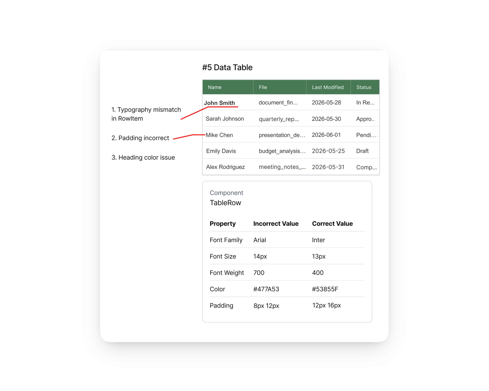
Built and maintained a structured Figma file cataloguing UI issues across the product, organized with a side index for team navigation. Each entry paired an annotated screenshot with exact specs pulled via Figma dev mode and CSS inspection, covering font family, size, weight, color hex, and padding. For component-level issues, entries linked directly to the correct component with corrected values. The goal was a document developers could action without a follow-up meeting.

Admin Layout
The admin interface managed large numbers of users and data tables, and at scale rows and labels were truncating and becoming unreadable. Redesigned the layout to handle high-density data more legibly, adjusting hierarchy, spacing, and truncation behavior so content stayed readable regardless of volume. Visual treatment was aligned with Lumel's existing design system throughout.
Solution
Marketplace Conversion
Researched UI layout patterns across comparable enterprise data visualization tools to establish how PowerTable's core functionality, navigation, hierarchy, and dense data display, should translate into the new marketplace environment. Findings were compiled into layout references and structural recommendations for the design team to use as a foundation for the conversion.
UI Issue Documentation
Built and maintained a structured Figma file cataloguing UI issues across the product, organized with a side index for team navigation. Each entry paired an annotated screenshot with exact specs pulled via Figma dev mode and CSS inspection, covering font family, size, weight, color hex, and padding. For component-level issues, entries linked directly to the correct component with corrected values. The goal was a document developers could action without a follow-up meeting.
Admin Layout
The admin interface managed large numbers of users and data tables, and at scale rows and labels were truncating and becoming unreadable. Redesigned the layout to handle high-density data more legibly, adjusting hierarchy, spacing, and truncation behavior so content stayed readable regardless of volume. Visual treatment was aligned with Lumel's existing design system throughout.
Impact
Over the course of the internship, the UI issue documentation system became the team's standardized format for communicating bugs to developers, consolidating a process that had previously relied on ad hoc communication. The admin layout redesign and marketplace research fed directly into active product decisions. Working within a professional product team on enterprise tooling with real engineering constraints shaped how I think about design at scale
Impact
Over the course of the internship, the UI issue documentation system became the team's standardized format for communicating bugs to developers, consolidating a process that had previously relied on ad hoc communication. The admin layout redesign and marketplace research fed directly into active product decisions. Working within a professional product team on enterprise tooling with real engineering constraints shaped how I think about design at scale
Impact
Over the course of the internship, the UI issue documentation system became the team's standardized format for communicating bugs to developers, consolidating a process that had previously relied on ad hoc communication. The admin layout redesign and marketplace research fed directly into active product decisions. Working within a professional product team on enterprise tooling with real engineering constraints shaped how I think about design at scale
Over the course of the internship, the UI issue documentation system became the team's standardized format for communicating bugs to developers, consolidating a process that had previously relied on ad hoc communication. The admin layout redesign and marketplace research fed directly into active product decisions. Working within a professional product team on enterprise tooling with real engineering constraints shaped how I think about design at scale
Over the course of the internship, the UI issue documentation system became the team's standardized format for communicating bugs to developers, consolidating a process that had previously relied on ad hoc communication. The admin layout redesign and marketplace research fed directly into active product decisions. Working within a professional product team on enterprise tooling with real engineering constraints shaped how I think about design at scale
Over the course of the internship, the UI issue documentation system became the team's standardized format for communicating bugs to developers, consolidating a process that had previously relied on ad hoc communication. The admin layout redesign and marketplace research fed directly into active product decisions. Working within a professional product team on enterprise tooling with real engineering constraints shaped how I think about design at scale
Over the course of the internship, the UI issue documentation system became the team's standardized format for communicating bugs to developers, consolidating a process that had previously relied on ad hoc communication. The admin layout redesign and marketplace research fed directly into active product decisions. Working within a professional product team on enterprise tooling with real engineering constraints shaped how I think about design at scale
Takeaways & Key learnings
Takeaways & Key learnings
Professional constraints
Understanding the constraints on the engineering side changed how I scoped features, how I communicated design rationale, and how I thought about what "done" actually means on a shipped product.
Documentation = design work
Writing specs precisely enough that a developer could act on them without a follow-up conversation is a skill that sits at the intersection of design and engineering, and it made me a better communicator across both sides.
Data-dense interfaces
Data-dense interfaces don't have a "simplify it" solution. At the scale Lumel operates, everything in the admin layout needed to be there. The design problem was legibility and structure, not reduction. That distinction changed how I approach complex information design.
Takeaways & Key learnings
Professional constraints
Understanding the constraints on the engineering side changed how I scoped features, how I communicated design rationale, and how I thought about what "done" actually means on a shipped product.
Documentation = design work
Writing specs precisely enough that a developer could act on them without a follow-up conversation is a skill that sits at the intersection of design and engineering, and it made me a better communicator across both sides.
Data-dense interfaces
Data-dense interfaces don't have a "simplify it" solution. At the scale Lumel operates, everything in the admin layout needed to be there. The design problem was legibility and structure, not reduction. That distinction changed how I approach complex information design.
Takeaways & Key learnings
Takeaways & Key learnings
Professional constraints
Understanding the constraints on the engineering side changed how I scoped features, how I communicated design rationale, and how I thought about what "done" actually means on a shipped product.
Documentation = design work
Writing specs precisely enough that a developer could act on them without a follow-up conversation is a skill that sits at the intersection of design and engineering, and it made me a better communicator across both sides.
Data-dense interfaces
Data-dense interfaces don't have a "simplify it" solution. At the scale Lumel operates, everything in the admin layout needed to be there. The design problem was legibility and structure, not reduction. That distinction changed how I approach complex information design.